


.png)


.jpg)


.JPG)


Happy Colors

I'll admit it...I LOVE pastels! Especially bright ones
I'd be so happy living in these spaces with these lively bright colors.

The bright green against the aqua walls is amazing!
And I don't usually like green very much. (except outside - love it outside)

I don't like different colored walls as a rule either but here...it's wonderful.

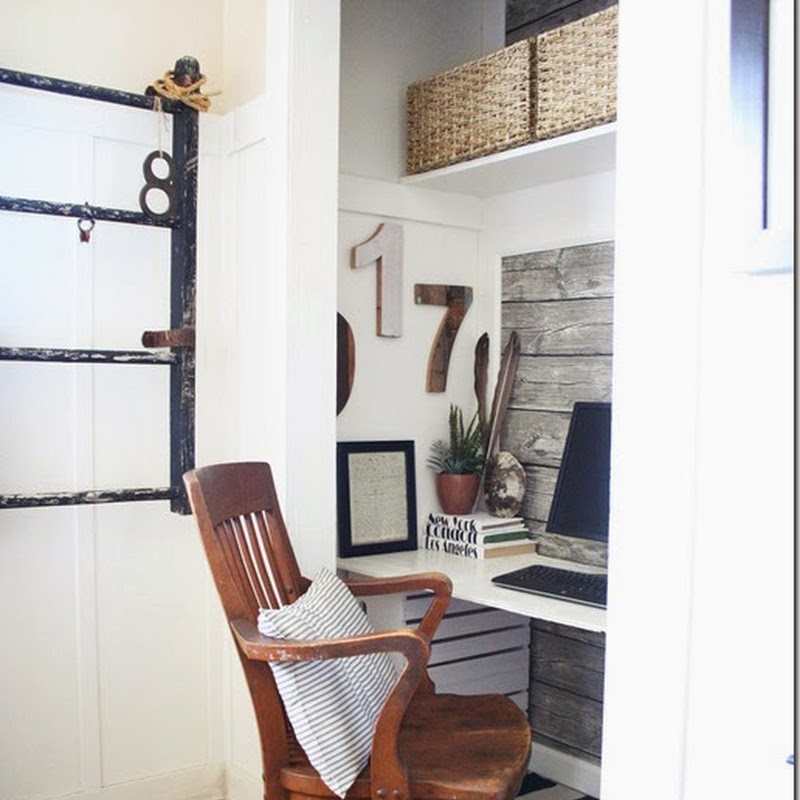
Oh...I'd love this room for an artist studio slash green house!
Which by the way...I've been doing some canvas painting.
I'll share soon.

This room is an example that you can still have bright pastels without saturating the room.
I'd be more likely to do this sort of room.
But after the others it seems kind of boring.

And the bits of bright pastels in this room really make it.
It would be dull without them.
Do you like bright pastels in a room?
Of course I love them at Easter time. Really I love them any time.
I did have a bright yellow rug with big pink flowers in my living room.
Because I was going to embrace bright pastels..but I grew to hate it.
I think I just put the bright in the wrong place.

I searched for photos of the rug but by the time I started this blog...I was already so sick of it,
I barely showed it.

Here is another little bit of it.
Then I just realized with my covering of my new ottoman in this fabric...

I'm totally headed back that way again.
I do love them!
Although I think this has enough brown and beige in it to ground it in the room.
I guess you love what you love and it always works it's way back into your decor.


12 comments:
Those blues are gorgeous! I just painted my powder room lime green (a bright pastel!) Come over and see it!
http://wherethegrassisgreener-rz.blogspot.com/2013/03/powder-room-reveal-don-your-sunglasses.html
Oohs and Ahhs coming from me! Blessings, Patti
STOP IT NITA!
STOP IT RIGHT NOW!!!!
Ha!
I'm getting ready to paint the different rooms in my house after changing my mind back and forth and back and forth...and NOW I've changed it again!
Love Love LOVE that 4th photo SO much!
and I'm SO excited to see what you have painted! I'm so glad to read that you are painting!!!
xoxo - Cindi
Oh how I love Pastels! So soft yet, can really pack a punch if done right! I adore that turquoise sun filled solarium.
You are so right, you will go back to what you love no matter how much you try to be conventional with others ideas. I love that house with all the stimulating colors, so happy.
I have to have bright happy colors or I'd go nuts, especially in winter when we're cooped up inside so much.
When we moved to MT from San Diego I had to paint our place in bright colors as believe me I was cooped up in house alone for weeks as hubs was gone on road. I had a good time prettying everything up and finding great places to shop. When we lived there Helena there weren't many places to shop so I'd go to other cities. I learned how to drive in bad weather on very bad roads. Only way to learn. Happy Days
I do love bright pastels. I have greenhouse envy! Wow, that would make a fantastic art studio! I pinned the dining room on my Pinterest board, "Stunning Dining Rooms." LOVE it!
I have bright pastel accents throughout the house, especially in the dining room with the mosaicwares collection. The wallpaper in the art studio and the cubes in there are bright, too.
It's funny because I use really bright pastels for my Christmas decor with bright red as an accent only.
I think if it's something that you truly love it will work in your home. I like that rug, Nita (what I can see of it). I can see it next to your pink chair, and I really like it. The fabric for your ottoman is great. I love chartreuse (lime) green! Do you have lime green accents to go with it?
xo,
RJ
PS WHat's that neat yellow thing behind your chair? Is that a lamp?
Your fire place already has a nice pastel colour! I love your chair and sofa and how they contrast with the fire place.
This is a look that I am also madly in love with right now. the colors are good enough to eat. Thank you for brightening my day, Nita, Sally x
Those ARE happy colors! Have you seen the UK blog Happy Loves Rosie ? She is SO colorful and such a fun site to visit! I think your ottoman will look wonderful in that fabric!
I like pastels, those are fun colors. From what I can see that rug looks good.
I find I get attracted to things but I know they would not have longevity in my own home~I would get sick of it. I love the pure aqua tones you showed in many of the rooms. So pretty and springtime fresh. I cannot wait for spring~its 20 degrees again in Boston, so bone chilling after a day of almost 50. Guess I am lucky I am mostly inside in a store. I want to do a window in forsythia boughs~
Totally agree about whatever you love will find a spot somewhere in your home...I just buy what I love and then make it work. Not lately, but I used to do that.
I think you're right, you love what you love and you eventually come back to it. Perhaps you have learned something, though, if you still have it, you might be able to use it in a more pleasing way this time.
I love all of the bright rooms, especially the whole room that is painted turquoise, love it!
Hugs, Cindy
Post a Comment