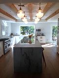
That kitchen above is Vanessa's of Vintage Whites Market Blog.
I LOVED this kitchen. I adored that big turquoise vintage cabinet and the cubby hole shelves above it.
But look what Vanessa went and did!
She stripped the paint from the cabinet and changed things up.
I thought I didn't like it...I missed the old version.
But after viewing both versions back and forth...I've decided......
I like the new version better! This really shocks me cause I loved it as it was soooo much!
A big plus are the windows they added which really brings light into the room.
Ok...which do you prefer?
The original kitchen with the turquoise cabinet - we'll call Version1
or
Version 2 with the new changes?


.png)


.jpg)


.JPG)


13 comments:
I think if the turquoise cabinet were in any other room, I would go for the before look. But, because it's the kitchen, I want it to look "cleaner", so I'm voting for 2. Adding those windows made such a big difference, too. And the floor is "cleaner", less cluttered-looking. I had to go back and forth several times — like you did — to decide.
Version 2 seems more functional, and I do love the new windows, but overall, I think it's kind of bland, though that seems to be the trend these days. I miss the color and charm of version 1. I would stack some colorful dishes on the shelves, and maybe add a funky light fixture over the island. It's a really nicely-done reno, but it needs some personality.
I like version 1 better but I would add the windows. I like both. I would like to be able to go back and forth, in real life, by snapping my fingers!
I really loved the shelving in version 1. But I like the white floor and stripped cabinetry of #2. So I'm torn. The windows were a big addition as well. I think I'm voting for #2, but I wish they'd bring back the beautiful shelf.
I think they are equally beautiful and inspirational.
I'll take door number 1 please. I'm a paint anything that stands still kind of girl.
I like.....Version #2
Especially the windows
and the light fixtures
and the shelves
and the white floor
The stripped cabinet....
Hmmm. OK, I do like it
but I might like it another color too.
ONE! This is one of my favorite pins!
I do like the island in two however.
I like version 2.
It does look fresh.
Version 2. Love the new windows and island.
Hands down Version 2! The cubby shelf was neat in Version 1, but the new shelf works well too, maybe better! The windows and island addition make it a better working kitchen.
For looking at and just being in, I like #1. For cooking, #2. But since I don't cook very much, I vote color and cozy -- #1. Besides, if it were mine, there is no way on God's green earth I could keep #2 so clean and sterile looking, even if the only thing I ever cook is breakfast.
I love both versions as well but my heart still jumps with the first one. I wish she would have left the harlequin floor. I think it would have kept some of the charm from the previous one.
Post a Comment