


.png)


.jpg)


.JPG)


built 1929
Oh...I have a lot to say about this house.
It's on my street and from the outside has many similar design elements.
It has a higher peak to the roof line which I like and wish mine had.
It has the same serpentine column on the front porch but has curved steps rather
than just the normal steps mine has. It also has wrought iron around the side porch which I like.
And it has a big window in the living room which I wish my house had.

I was shocked when I drove down the street the other day and saw this home for sale.
It had sold only last February.
Earlier this summer, a friend in the neighborhood had called me to tell me she was very upset about the
changes being made in that house.
She had stopped by to see what all the workmen were doing there one day.
Supposedly, the new owner was moving up from Texas and wanted the home totally renovated
before he moved.
This is a beautiful home and the quality of materials used in this renovation are very very nice.
Unfortunately, all the historic character of this house has been destroyed.
Word is he hired a local decorator to oversee this homes reno.
This decorator usually works in non historic neighborhoods. Her lack of knowledge of historical significance of original detail is obvious by what she has done to this house.
Let's start with the outside lighting.
It's too large and obviously new.
I would have either put in true vintage light fixtures or bought new that looked old from some place like...

Here are a couple of their options that would have been appropriate.


Both have matching fixtures for the porch.
And they are the correct scale for the house.
What they put up are too large and look like they were bought at Home Depot although I'm sure they weren't.

The home has a cute little side porch. I'd love to have this.

The garage looks great. I didn't think doors like this were allowed as per historic rules.
But perhaps they are and I do love them. This is about the only good choice the decorator made.

You can see the Texas vibe in this decor.
They added the fake wood beams.
They only detract from the beauty of the original ceiling.
It should have been left as was.

This home was redone for a single man which is why the decor is so masculine.
Way too much brown.
The sideboard is covering up a large amount of the front window!
It's too big and in the wrong spot.

Here is the biggest tragedy. They ripped out the original art tile fireplace!
They didn't even have the sense to at least take it out carefully so it could have been
put in someone else's home.
A girlfriend of mine was just sick about this because she wanted it for her house.
My friend who went by that day said, "I hope you realize you just tore out $20,000 worth of tile".
The workmen did not care. They were just doing as told.
Just a terrible mistake. I can't believe the decorator was this stupid.

The dining room.
I like the color on the walls...thank goodness they kept the old heating vent. I love those.
Those chairs are too large for the space and the wall clock is dumb.
A poor choice of a chandelier. A vintage one would be so much better.

They widened the doorway to the kitchen and added a bar. Fine in another home but not in this one.

Here you can see the bar.
They gutted the kitchen and ripped out the wall between the kitchen and breakfast nook to make
the kitchen larger.
I understand why they did this but again it's taken away the house's character.
I was never in this home before renovations.
I was told it was very very nice and I believe that because it sold for top dollar.

I'm sure there was probably a lovely built in china cabinet in the breakfast nook where this cabinet
and stove are now.
I will admit this is a beautiful kitchen and that stove is gorgeous.
But I would have rather seen it done over to look more vintage and kept the original breakfast nook.

It's a pretty kitchen...it's just too modern for this house. Personally I don't really care for refrigerators
with cabinets built all around them. I know it's still a fridge. Let it be a fridge.
Same for hiding fridge doors to make them look like cabinets.
It's a kitchen...it's ok for there to be a refrigerator.
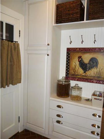
Nice spot by the side door for the dog's stuff. I do like this.

There appears to be two baths.
I like this one the most because it retains the vintage feel a little bit although all the tile has been ripped
out and replaced with marble and subway tile.


This is the other bath.
Love the towel rack.

Again subway tile and marble.
Yes, it's beautiful but where did the original tile go? And from what I understand these baths were
in pristine condition before they were torn apart.
I like that lavatory but not here.

Close up of tile. Pretty but not true to the historic feeling that should have been considered.

And the backyard. No photos of the bedrooms which is disappointing.
What do you think about this house? It makes me very sad.
I have nothing against the way this house looks except it should never have been done to a 1929 home.
Now this guy has it up for sale.
I don't know what happened but I guess he does not want to live here after all or his plans changed.
I'm sad that whoever lives here in the future will never experience the original details of this home.
This home could have been renovated in such a way that would have kept the character and would
have modernized it too.
You can see the listing here.


15 comments:
I love the living room and dining room and like the beam. I think the kitchen window looks dwarfed beside the cabinets. I would like to have seen just the subway tile and not the marble mosaic or the marble floors which are not in keeping at all with the house. A simple hex marble tile would have looked better or a herringbone.
Our old house in Florida needs a new bathroom. The original tile is awfully ugly and needs to be removed. I am delaying because I am tryign to find suitable substitutes.
Nita,
I love your passion! Your outrage over the things done wrong is appreciated. The normal person wouldn't know or have a sensitivity to the right choices. It's a little surprising to see a decorator make some of these choices. I did gasp out loud when I saw the fireplace. It doesn't fit with any of the three or four styles going on in the house.
Well it is obvious that there was no connection or consideration to the architectural style. I do love to see older homes keep their character~why didn't he just buy a new house to begin with?
Forgot to say that I think the fireplace is dreadful.....not an ounce of charm and certainly not in keeping with the house....and as Urban Cottage says, lots of different styles going on. A fireplace could sell me on a house..Not this one.
OK-
I liked the garage,
the second bath but switch out the bunny painting for one of dogs
and I like that weird painting above the fireplace. LOL!
and that's about it.
My sister used to do the gardening at a multi-million dollar home built from the ground up in everything French. When the owners decided to move, the new buyer GUTTED several rooms...why? Why do people destroy perfection when they have the cash to build new?
I agree about that fireplace, glad I didn't see the old.
Sad...
and YOU should be a decorator! You definitely have the eye!
:) - Cindi
any chance of you posting about that fantastic Art Deco house that you showed the exterior of last week?????
LOL I feel your pain. I'm guilty of doing some upgrades that are not with keeping to my home. I feel some things that are over 100 years having to go. :-)
Dee
Sad is the only word that comes to mind after seeing these renovations. Why do people buy a older home when they obviously don't want to live in one? I wish we could have seen it "before".
Traci
The fireplace and fake beams are largest and foolish mistakes. The decorator didn't seem to be decorating and entire house either. It doesn't seem flow very well.
I do like the outside porch though.
A decorator actually put those skimpy not to the floor drapes/curtains in this house too? Amazing !! Joni at Cote de Texas would never have done this. Nor would I. And they look purchased from a catalog or worse. Just my 2 cents. I get the idea of retaining the original flavor of the house but I really do like the remodeled kitchen - sorry!
The poor decorator on that house. Keep in mind that when you design for a living, you can lead a horse to water, but... Sometimes, what a client wants rules, and who knows, the client is maybe the one who had the awful sense to change that fireplace. That one's the biggest crime ever! Being a designer myself, sometimes I have been less than proud at the end of a project because you can only do so much -- people want what they want, no matter what you say. And then you end up with a project you'd rather not have your name on. I hope that's the case with this decorator -- because I agree, Nita, it's a total bummer.
I love the porch and the entire dining room. I love the white paint as base and the fusion of wood elements in the furniture.
Though I have to agree with your sentiments over the fire place. I always adored homes with elegant fire place. Unfortunately I live in a tropical country so fire place is not necessary here ;-)
But overall, I love the house and I can see myself living in it.
Great post. Thanks for showing us this house. I've had the good fortune to go into several homes in this neighborhood, so I am appalled by some of the changes made here. First off, that fireplace is atrocious. Too modern for this house. And those beams!? What were they thinking? A very standard "Edmondy" "Nichols Hillsy" decorating job, I suspect. (Nita, you know what I mean. This person should have moved to one of those areas if they wanted a look like this. A nice decor, just not meant for this home with such history.) One of the things I love most about these historic homes is that, when I go into them, their decor is not all matchy-matchy. I don't like it when every light fixture, every piece of hardware, every design element looks as if it were just added. I like a look that has evolved over time. It's sad that so much Tudor charm has been lost. I've seen bathrooms rebuilt to look like their originals and they were charming. Not sure why they went with such a modern vanity here. And, last but not least, I believe those are Pottery Barn curtains hanging in the dining room ... some of PB's most expensive. The dude had some money, that's all I've got to say. ... And it makes me sad that I couldn't have afforded this home. I had to pick a newer home because we needed more square footage and we couldn't afford a home in this area.
At least the light fixtures can be replaced over time. It's a real shame about the tile, esp. the fireplace. The decorator could have been "hamstrung" by the wants of the client. Unfortunate.
Well, I'm in agreement with everyone else. Such a gorgeous home on the outside. Some of the interior is ok but I really wanted to cry when I saw that fireplace. I'm not sure why a person would buy an old home and then change it rather than buying a new home. At $177 per sq ft, it wasn't cheap. And no telling how much he paid to make all those changes. Some people have more money than sense.
I so agree with you. It makes me so sad to see that. Why, oh, why? I hope the owner moves back to Texas rather than destroying another lovely home. Ugh.
And I love that you're not afraid to say what you really think.
Post a Comment