I just got an email from one of my followers and fellow artist - Adam and he said he wanted to let
me know that he could not see the word Vintage in my header on my blog.
He said it is always light but with the new Valentine Art he cannot see it at all.
I've viewed my blog on several computers other than mine but not recently and it viewed fine...
but maybe I lightened it this month...I can't remember.
Anyway...I'll probably go ahead and darken it some but want to know if it is showing up for you as it is now.
Or if it is hard to read.
This would be of great help to me to get your feedback.
Thanks so much...it's hard to design for the internet because everyone's computers
see color a little differently.
Your help in this matter is greatly appreciated.


.png)


.jpg)


.JPG)


39 comments:
I can see it fine although I do think it's lighter.
Depends on the angle of my screen on my laptop, it tends to blend in with the white background simply because there is not much of a contrast there. Anyone that is viewing it that does not have good vision might find it hard to read...or if their monitor's contrast setting is on the low side as well...anyway that is what I see and think...*two cents for your bucket*
Or they could just be distracted by your cute weenies and forget to look at the banner like me ;)
Blessings Kelsie
It's lighter than the other two words but I can definitely see it.
I can see it, but it is much lighter depending on the angle I look at it. I hope that helps :)
I can see if fine
I can see it just fine!
I see it just fine too, but I agree with the two first answers here:) It depends on how I tilt the screen and it seems a little lighter than the grey writing below it!
I can see it fine, but it does appear lighter than the other words. Loving the hearts :)
No problem seeing it on my computer.
I can see it just fine. Maybe it is his contrast.
I can see it, too!
I see it fine too, but then when I messed with the angle of the screen of my laptop I found if it's straight up and down, it does disappear. Oh well....soon it will be green right!? For St. Paddy's?
(tee hee)
:) - Cindi
Like others, I too can see it when I have my screen in a certain position but it is really hard to see if the screen is at a 90 degree angle. Apart from that your header is so pretty! Your blog is always lovely to look at.
Best wishes always,
Natasha.
Loud and clear. I mean quiet and clear. I thought the lightness was intentional.
It looks great to me. I see it as a light gray and I think it is very pretty. Kit
No problems seeing it on my screen. BTW, I really like your header.
I can see it just fine! No worries here!
I can see it fine on my laptop...but my PC will probably be a different story. I can't see the decorative borders of my own blog on that computer, so I bet I won't see Vintage on it either. I'll run up and check. Does anyone know how to make the contrast higher?
I know you mean to have it lighter and it looks really pretty.
Yup just as I figure, I cannot see the vintage on my PC monitor. So I guess you should darken it for some of folks that have contrast issues like me. I would like to figure out how to fix it though...
Hi Nita,
I can see it fine at all angles. MacBook here.
xoxo~Tracie
I'm on a MacBook too and your header is perfection!
See it fine on my computer... it's a Pale Gray but distinctive against the white background.
Dawn... The Bohemian
I can see it Nita. Although I do have a problem with white backgrounds. Perhaps that is your friends problem?
I can see it Nita. It is light, but I can read it fine(and I am olden--lol)
Nita, it is light, but I can read it fine.
It is lighter but I can read it fine. Love the pink hearts!
Nita,
After all the suggestions about contrast I checked my screen. Its contrast was set at 63 after I lowered it to 50 the word came in great!!!! Even the scrolls around the hearts came in, I didnt even know you had those!!! Sorry for
all the fuss, but now I know it was my screen i'll have to adjust the one at work too.
Adam
I can see it fine..but I can see why it might be hard. I tilted my screen just to see if it faded & it did a bit.
Love the detail though :)
yep i can see it!
I can see it!
Comes across fine and dandy on my computer!
You guys are awesome! Thanks so much for letting me know how it looks and at what angles....yes it's suppose to be light...but I think I might darken slightly just to make sure everyone is seeing it clearly. And I guess the best thing that came of this is that we helped out Adam with the contrast on his monitor!!!
He had me totally freaked out....I was afraid no one was able to read my header.
Thank you sooo much!!!!
I can see it just fine. I like the hearts at the top...noticed that a few days ago and thought it was so pretty!
Nancy
Looks oh, so pretty on my iPhone!
Looks great from where I'm sitting :).
Looks fine to me too! Jana
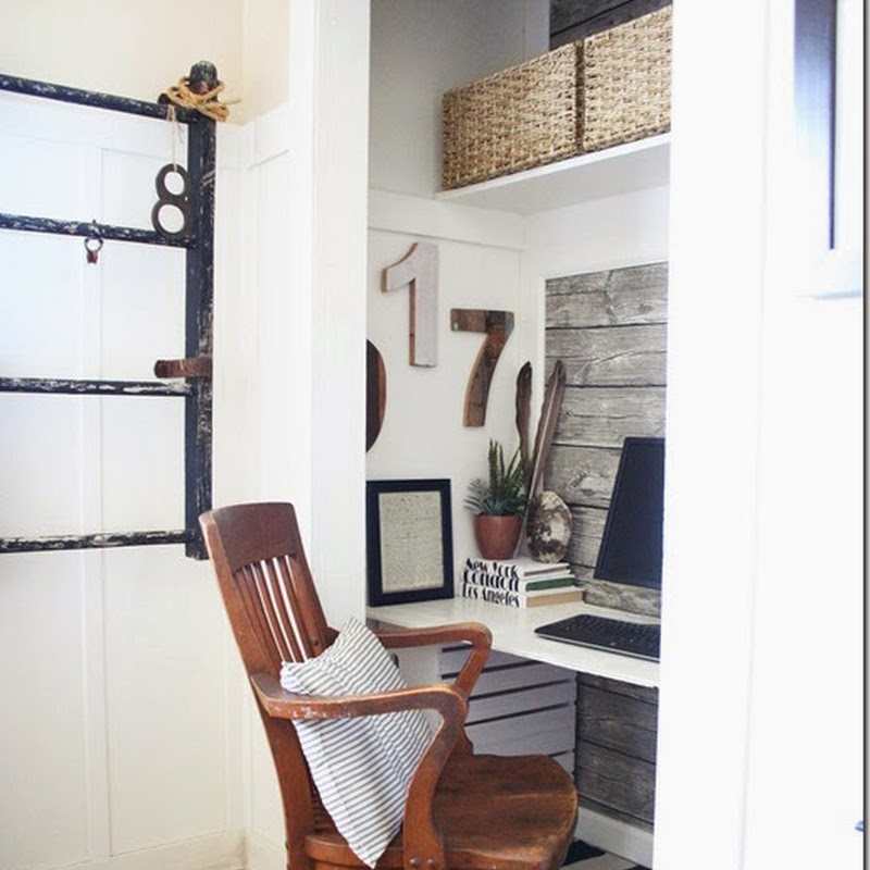
I could always see it just fine...those rooms are gorgeous...especially the first one...that did it for me..Dawn xo
Wonderful blog!^^
HI! my name's martina and I come from Italy... I'd like you visit my blog and if you want... follow me! I wait you and your tips! kiss kiss :D
marti
Glamour Marmalade
http://www.glamourmarmalade.blogspot.com/
I see clearly!
Post a Comment