- Evolution -
Yesterday I showed this kitchen.
But as I browsed some more I found a photo of a kitchen that looked similar, yet different.
Through more searching I found it was the same kitchen. It had evolved.
This is how it began.
Then became this
I like the blue walls
and the eclectic style.
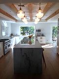
But then it became this -
which I really like too.
very mod vintage
Which version of this kitchen do you like?
I'm still having a CSN Stores Gift Certificate Giveaway.


.png)


.jpg)


.JPG)


21 comments:
The earlier versions were a little too cluttered for me, but I really like the blue walls too. Can I vote for a mash up of the two?
i think i prefer the latest version. it's just less cluttered looking. but i'd take either. and btw i still love your kitchen.
xo
janet
I prefer the all-white version. While I love the blue wall color, I think it closes in a narrow, small space. It's one reason I went with all white and very light gray in my kitchen; anything else made it feel too confined.
I would take your kitchen over any of these, yours has style:)
I like a combo too. I like the chandelier and the less cluttered look, but it is too stark white..maybe a pale aqua would look good. Between the floors, the ceiling, the walls, the cabs, and the table it is all too bland and blendy. I love the marble countertops in the newer version. So maybe a hint of wall color. Even pink would be fun!
I like the blue walls and the little shelves at the end of the cupboard which they took out on the second one. ~Alana~
I like the latest version with the white floor....but I wouldn't want to keep it clean!
I like the original one. Love the true vintage feel minus a little clutter. The all white is a little too stark for me. But I do like how they opened up the space.
This will probably surprise you because you know that I love everything white but....
I like the original except for the floors. I think if they had just painted them white it would have opened it up and of course I love the marble countertop!
I "dream" of marble countertops!
I'll take the original version. I agree, there are elements about the re-do I like but the character got lost.
I love the color palette of the earlier version. The all white feels a little clinical to me.
Congratulations Nita on making 500...u must be so happy. I am happy for you. Lovely white kitchen...Dawn Suitcase Vignettes.
Both are great, but honestly I would be more comfortable in the blue version. Just seems "homier"
I'm a vote for blue walls, it has so much more character to me - although I am a bit biased, as I am just coming off of 5 years with an all white/off white kitchen, I need COLOR! ;)
I like the one with color. That stove is awesome!
I prefer the all white version. Love all the white stuff especially the tulip table.
I really like them both, but probably the all white, very clean and fresh looking.
I like them both, but I do adore the blue paint and think I prefer a darker floor to ground the room.
Congratulations on your blog anniversary and 500 followers Nita!
That kitchen looks very Mod Vintage indeed!
-marie
I love the "before" one. It seems a little friendlier to me!
I love all the stages of the kitchen. There are elements of each stage that I adore. I guess that's why decorating is so fun! always new possibilities!
Post a Comment