built 1934
This charming Tudor sits catty corner from my house
just across the street.
It was for sale at the same time that I bought my house back in 2004.
It had been neglected for a very long time so
I didn't even consider buying it. I didn't even take a tour of it!
I did go in it about 10 years ago and realized it was a
fantastic house. The person that bought sunk tons
of money into it. Since then it has sold a couple
of times. And I won't be linking to the specifics on it,
because it already sold this time after being on the market just a week.
Check out the mother in law tongue plant filling the front urns.
I was shocked that these lived through the winter here!
The present owners have filled it with lots of mid century style.
I like mid century but in a 1930's Tudor...I like just a little mixed in.
The whole house full of mid century is just not warm enough for a Tudor.

The mid century styling begins on the front porch.
I will say this home owner goes with a style and carries it through the
entire house.
I often advise my interior design clients to break their living room
up into several seating areas. (oh yeah that's what I have been doing while I was gone from blogging. I was doing interior design connected with several furniture stores) More about that later.
So although I tell my clients who struggle with a long room to break it up into several seating areas -
This is not what I would do in this room.
My own living room is long and I have furniture placed around the focal point of the fireplace. Then at one end I have a desk and the other a console in front of the window.
I wouldn't mind the arrangement above but both of the seating areas are ignoring the fireplace which should be the focal point.
This room feels like a hotel lobby to me because of the way it's arranged.
mid century dining at it's finest
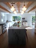
The kitchen was totally redone at one point during the last 15 years. I can't remember if it looked exactly like this when I was
in the house before. I think it didn't. I don't remember the marble subway tile.
I like the size of this kitchen. Seems everyone is doing a rug like this in their kitchen now.
I love original tile bathrooms but I'm not loving this one.
That tile is flesh colored. And I very much dislike the sink.
I hope the new owners do something great to this bath.
Nice that it has the original arch over the tub and some storage too.
I remembered I loved this built in shelf in the bedroom.
Another bedroom
Another built in
Small bath off the master bedroom. I love that the sink and mirror
set back into a little nook.

Here an Asian screen is used as a headboard.
Love that there is a
door going out to the backyard off this room.
Very nice backyard for entertaining. None of this was here back
when I bought my house.
I like their choice of outdoor furniture.
a lovely manicured space
This is where I always say see the full listing here, but it's already sold
so I can't.
Have a fabulous Sunday!
Mom and I are going to actual real life Open Houses today.
Not that we are buying a house but we love to look.
It's cheap entertainment.


.png)


.jpg)


.JPG)


2 comments:
Dining Room is perfect. The main bath was a miss. Thanks for the look inside this home. I do enjoy seeing how other people are decorating.
Didn't you feature this house in the past? Maybe with a previous owner? It looks familiar. Can't agree more about the "hotel lobby" and ignoring that amazing fire place in the living room. The light fixture in there is all wrong for this house. Why didn't these people buy a ranch-style home? I find MCM hideous, but, each to his own. The sink in the bathroom is a "miss" as Linda said. But I love the house itself!
Post a Comment