Tip Top Tudor
in Atlanta
built 1928
I love how this little tudor sits up high on it's foundation.
Do you like that? I do.
Extra special doorway
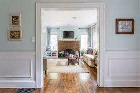
Normally, I'd want to paint that fireplace white but it looks pretty darn nice in brown with these blue walls.
Love that front door.
I like the cute little window seats on either side of the fireplace.
The curtains are very lacking in this room.They are too short and too skimpy.
I love this view through the doorway.
Cute little dining room with a very casual table. Very Casual, indeed!
If I lived here...I'd paint the kitchen cabinets white and change out the counter top and add a back splash.
Love this big built in.
Yes, paint those cabinets. I wonder what the original 1928 looked like?
I'm sure I would have liked that better.
Wouldn't take much to make this kitchen great, though.
Pretty serene master
The wall of glass tiles is pretty...but I never would have done this in this home.
I would have wanted the original bathroom or if it had to be redone...I would have redone to look vintage.
But no one would say this isn't a nice bath.
But no one would say this isn't a nice bath.
Love the original brass and glass door knobs.
I love the headboard in this room complete with lanterns hanging.
Another modern bathroom. Do not like this one at all!
sweet baby's room
I kind of like the counter top in this bath...although again...I'd rather it had been done in a more classic style.
Family room built on the back would be a perfect dog room.
small flagstone patio and what looks to be a very nice yard
I could work with this!
See the full listing here.


The house has good bones but I don't like it when you take an older traditional home and make the bathrooms and kitchen contemporary. Would have loved to get my hands on this house before the updates.
ReplyDeleteTotally agree about kitchen and bathrooms...why? You have this wonderful charming homes and do that to kitchen and bath. I too would have loved the original kitchen and bath...
ReplyDeleteThe exterior of this house is beautiful. I especially like the front door; you just don't find details like that in new construction.
ReplyDeleteMost of the interior is nice because it looks like they didn't change it that much. However, I have to agree that the kitchen and baths detract from the house. It gives the house a split "personality"-Hansel and Gretel outside and the Jetsons inside. I don't get it but to each their own. As you said, a classic (white) look would be more appropriate and I feel it would add more value to the property.
How can the outside be so wonderful and the inside so nondescript? I'm with you in that I would rather have seen it redone inside to reflect the era of the house. I agree with you on the higher elevation of the house...lovely.
ReplyDeletePretty house but I would love the more traditional vintage remodel..still very nice home.
ReplyDeleteI like the foyer, living room, dining room and baby's room but didn't care for the kitchen or bathrooms at all.
ReplyDeleteLove the front door the most and yes the blue walls make the dark fireplace okay. So many charming features in this home. Not a bad price either for that area! Thanks for sharing I missed you last week. Hope all is well with you the weenies Mama and Sister.
ReplyDeleteThe exterior is very charming. xoxo Su
ReplyDeleteThe outside of the house is so charming. I have to agree with everyone that the bathroom and kitchen updates do not feel like you are in the same house. I am with you Nita I would be painting the fire place brick white lol! Just sayin!!!
ReplyDeleteHave a great new week ahead.
Kris
Such a lovely old home with a nice airy feeling inside.
ReplyDeleteGood tour.
Denise