This little tudor is in my neighborhood. It went up for sale last month and sold within a week.
I shared this home last year when it got Yard of the Month.
At the time...I didn't get upstairs photos and I was losing the light when I took the photos
so I thought it a good idea to share these again.
Some of these are my photos and some are the realtor's photos.
The front yard has a natural landscape. The grass is buffalo grass.
The owners took out the front stone steps and manicured the lawn before putting it up for sale.
This is how the yard appeared last year.
I guess they were afraid new potential owners would not like the wilder look of this.
This home was abandoned for years in the neighborhood.
It was owned by a family that moved out long ago but did not want to sell it.
So the home sat empty for like 20 plus years. Cats and raccoons were living in it!
Finally, the owners pushed by the neighborhood's attorney...agreed to sell it.
The new owners had a monumental task of getting this home back into shape.
I love the balcony that looks over the two story living room.
Notice the brick fireplace?
When I toured the home last year...the fireplace was just rough brick remnants of what had been before.
If you'll notice the brick is flush to the wall.
The owners built it out from the wall.
An interesting choice...it still feels vintage. I had this same situation in my own home.
Someone has ripped out my fireplace decades ago.
I built a fireplace made of antique tile and new antique looking tile to resemble a fireplace of the
period.
This fireplace would not be what would have been originally.
There are only a few brick
fireplaces in the neighborhood - most are tile.
Although it's not original...it works in this home. I'd add a mantel. Something rustic.
Ok, I'm not sure if that is how that light fixture in the dining room is suppose to be
or if they put a bag on it while painting the room. What do you think?
This was how the light appeared when I took photos last year.
There were no kitchen photos on the MLS listing so I was glad I had shot a few.
I thought this kitchen was just amazing. It was small and had no upper cabinets.
But I love the finishes. Love that little nook above the stove.
Marble counters always make me happy.
This is the ceiling in the kitchen.
Beyond the kitchen was a little room just before the backdoor.
There this fabulous industrial sink provides extra prep space.
This little room does have cabinets.
Another little nook.
And stainless steel shelving for glasses.
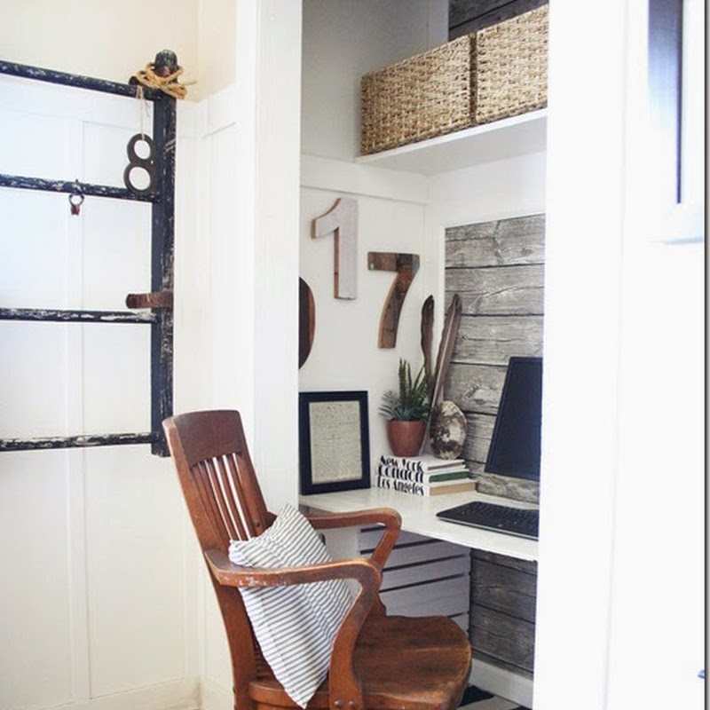
A nice simple office. Oh...I wish I could live this simplified.
This house is amazing in that it has arched top doors inside.
Upstairs is the master bedroom.
Wonderful ceiling angles in the top rooms of this home.
This is the master bathroom upstairs.
That sink is original to the home.
It looks pink in this photo but it's actually lavender.
The home owner told me she was soooo excited when she found electric sconces in
a matching shade.
All else in this bathroom is new.
I hope the new owners keep this sink.
It's just too fabulous!
I don't have a MLS page on this home...I'm sorry to say...cause it sold too quick!
Someone got a very special house indeed.


.png)


.jpg)


.JPG)


13 comments:
Gorgeous house! I actually prefer the more "wild" yard to the manicured version, but that's just me. I agree the bathroom sink is fabulous; I hope it stays there forever! Thanks for sharing, Nita!
I don't know if the wild looking lawn would go over well in our town, but I love the way it looks! Lots of amazing details in that house! Thanks for sharing, Nita, and have a great day!
Hi Nita! Thanks for sharing that fun house with us. I hope that the new owners put more period furniture in it...all the modern stuff just looks out of place to me. The new owners have my permission to mix in a FEW modern things. Lots of cute nooks and crannies in this charming home. I love the yard of the month with the pumpkins and your new alabaster lamp and circular frame too.
The little nooks in the kitchen are so fun!
Wow! that house decor is certainly eclectic! They have tastes different from mine and I love modern. LOL!
To each their own.
I love the house itself and I agree about the mantel. Maybe a thick dark rough wood?
Thanks for the Sunday Open House!
It's so fun to see the insides of peoples homes and how they decorate, and the yards too!!!!
Thanks for sharing, have a great week,
~ Violet
That front yard was to die for. And, in Oklahoma.
Nice house. I love the wood on the ceiling. I want wood floors just like that! I think the light fixture in the dinning room has been replaced and looks cool, well until you said it could be a bag, lol.
I can understand why this house sold so fast because it has loads of character. I'm not fond of the modern décor but the former owners did a great job of fixing it up.
I loved the old landscape because it looked natural but not messy. It worked because it was a good balance of plants appropriate to the Oklahoma location used in a relaxed design to blend with the cottage style of the house.
A friend I often debate whether a garden such as this helps to sell a house. She says it does, I say no because it's too personal. Your post proves me right; most people want a blank slate.
I love your neighborhood! Thanks for the tour.
I have mixed feelings about the way the house is decorated, but the house and all its little nooks are charming.
I love the look of the home's interior. I laugh when I saw the nook off the kitchen with the 'industrial' sink. I have one just like it in the basement of this house (I moved in almost a year ago and it is similar age and style). It is the laundry sink and is located right next to the washer and dryer. I cannot even imagine putting any of my laundry into it. Clean out some paint brushes? Yes. In fact, our home inspector suggested the best thing would be to take a sledge hammer to it to make it easier to remove as they are extremely heavy due to their size!
The 'bag' light fixture is indeed a new one. I've seen them scattered throughout some of the trendy home décor stores up here in Toronto, Canada. I think they could be huge dust collectors but perhaps since they're made from cloth, the designers are expecting us to add them to our weekly laundry. lol
I wish I could live more simply too. I know we all could do it but it's just that matter of letting go of 'things'. I've already done a lot of that downsizing to this home which is a quarter the size of my last one. I still have some unpacked boxes in my basement *blushing*, that will need to unpacked. If they contain 'must keeps', I guess I'll be doing some more 'editing' of what I've brought or, shall we say 'simplifying'? lol
Thanks for sharing this home in your neighborhood. You were indeed meant to be living there with your mom in the house you found.
I'm so glad I stumbled onto your blog a few weeks ago.
Love that house! So unique and I adore the arch top doors! Reminds me of the storybook houses in Carmel!
Miss Bloomers
Hi Nita, I love the yard with the natural look. The house is pretty. I love that velvet sofa. I have been away for a very long time but am back now. xo, olive
Post a Comment