Spanish Colonial
in California
built 1926
Oh...my I am crazy for the flowering vines over the doorway on this home.
I think it is climbing roses...but it might be bougainvillea.
First through the door you find this fun wallpaper.
That's a surprise!
I love how the ottoman in the next room plays off the colors in the wallpaper.
I love this ottoman and the red octagonal table next to the sofa.
Wish we could see more of that green credenza.
Fun retro furniture in this room including the bar cart.
Nice black and white kitchen. I like the island but it seems a bit traditional for this house.
Fun striped shades almost look like awnings.
Is that two dishwashers and a triple sink?
I don't think I've ever seen a triple sink.
Very cute banquet.
And I love the artwork. Yes, I'll try a Twinkle Soda!
Appears to be a butler's pantry off this area. Look at that window high up!
Very pretty.
This room needs some better arranging but I love that rug.
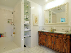
And I always go for a venetian mirror in a bathroom. Always
Pretty, simple, tasteful bedroom. What a calm place to sleep.
Any little girl would love this room.
And any grown up would love this bathroom.
I like those built in glass shelves.
But the veranda is where I'd be all the time. This is so wonderful.
Very nice backyard with a very cute garage.
I could live here...that is for sure.
See full listing here


This house has a great California vibe, doesn't it? Love the splashes of color. Just imagine that island painted a bright color!
ReplyDeleteI love Spanish Colonial houses; reminds me of the ones Diane Keaton has done. I love the use of wallpaper in the foyer but not sure about the pattern. I know it needs something bold but that looks a little too traditional. And I know designers often paint trim the same as the walls but I hardly ever like it and don't like the trim the same as the walls in the living room. But the arch is nice and the retro furnishings and the touches of red carried throughout. I wonder why so many appliances were left sitting out in the kitchen for a house that's for sale, especially that large toaster oven? I can't do without mine but would pack it away if my house was on the market. The best thing about the whole house is that second floor veranda! There would be so much privacy and you could see out over the street and into the treetops. It would be hard to leave it.
ReplyDeleteNice tour, Nita!
Very pretty! Have you bought your ferns yet? I bought two yesterday at Sams. Then heard they were cheaper at Lowes. These are nice and big though. I don't know about the ones at Lowes. They're always my first purchase of the year too. Seems like if you don't grab them pretty early, all of the good ones are gone.
ReplyDeleteWow what a home. Seemed a little empty until I read in comments it's for sale. Still no art work at all and the office was almost empty. Loved all the colors. I'd sure love that balcony at any time.
ReplyDeleteIt's funny that both in the kitchen and in the bathroom they have a fake window turned into a mirror. I love the balcony.
ReplyDeleteIt's possible that's a Kosher kitchen, although very small. They require almost two of everything, for cooking and cleaning up dairy & meat.
ReplyDeleteCheck out more here! http://www.jewishvirtuallibrary.org/jsource/Judaism/kosherkitchen.html
I enjoyed the entry, and the retro living room! I'll have an Old Fashioned please!
That's a gorgeous house, I could live there, too. I love the butlers pantry, and the bedrooms are large and pretty, as well as the bathroom. I love the cabinet that the sinks are in. My favourite place would be the veranda/porch.
ReplyDelete