Goodbye Animal House
I awoke yesterday morning to the sweetest sight....a for sale sign in my next door neighbors yard. I've been hoping for new neighbors there for a long time. You see, that home was bought shortly after I bought my house by a man that fixed it up for his newly graduated from college son and his two male roommates. The plan was for them to live there while they went to medical and law school.
I affectionately call it "The Frat House". I have to say that it was renovated nicely. But having three young male twenty somethings and their three girlfriends there all the time with their six vehicles was less than ideal. And yes, there were all night parties. Actually, it could have been much much worse. (I only found beer cans in my front a yard a few times) The parties would not have really even bothered me if it hadn't been that the dogs would hear the partying at 3am and they would get up and bark.
Actually, the last year it has been pretty calm over there and the number of vehicles had lessened to about three a night. So I'm thinking someone moved out.
But now the Frat House is for sale and I'm hoping for a nice middle aged couple to move in who love to do yard work or better than that...a gay couple who'll be as into decorating as I. And I hope whoever it is - is as crazy about Halloween as I am. I make my house the scariest in the neighborhood and I'd really like someone to join in on my spooky passion.
I thought I'd share the MLS photos of this house. It has the same layout as mine and is pretty much the same size. My house is much cuter though.
The Frat House
This is what the house looked like before it was redone five years ago.
It was painted white and had screens across the porch which looked hideous. They had already been removed at this point.
The inside...notice the frat house decor. I see these photos were taken while they were watching "Lost". I think perhaps they should have untied the curtains for these shots. But this is how their curtains look most of the time, tied in knots. Notice the speakers in the corners of the pullman ceiling? Those would be the first things to go, if I bought it. But then I guess they will most likely take them with them.
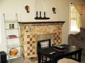
The sconces were added. They are vintage but not original to the home. I was in this house before it was redone and the walls were all painted peach and there were southwest style sconces on the walls. It was hideous. The center light fixture is vintage....but looks like something that would have come out of a large commercial building. I'd change that too. Although it's a really cool fixture...it's just not right for the home.
Wow...the decorating is sooo bad...looks like the sconces over the fireplace do not match the sconces in the rest of the house.
This is not the original fireplace. The original one was a solid cement one that was molded to look like it was brick. I've seen these on other occasions when going to open houses. When they were redoing this home...a vintage tile fireplace was found that had been taken out of another house and so they installed it here. The nook above the fireplace is original to the home.
This is looking from the Living Room into the Dining Room. At first when I bought my home, I wished my house had the built in shelves that many of these homes have. But now I am very glad that my home didn't have them because it really cuts down on the wall space in the living room. I have mirrors on either side of my archway with a desk on one side and a chest on the other. Which I've decided I like much better. But then I don't have an awesome spot to store my DVDs like they do. This sends chills up my spine. The atrocity of it all.
Dining Room. Love their choice of art...especially the OSU jersey on the wall in the breakfast nook.
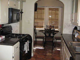
The kitchen. Why they chose that tile...I'll never know...mexican terra cotta tile mixed with granite counter tops and tumbled marble on the wall? The next owner is going to have their work cut out for them. Those look to be the original cabinets. I absolutely hate that floor here. And I am sick to death of tumbled marble. It's fine in a new home...I don't want to see it in a vintage home and don't even get me started on slate...I hate, hate, hate slate...but in this case slate would have looked better on the floor than this mexican tile.
Another shot of the kitchen...I kind of like the ribbed glass in the cabinets...it's different and vintage. I do have to say that the tumbled marble looks pretty here against the dark granite. I just would not do it in a historic home, ever.
I love the vintage black and white bathroom. Oh look...original toilet...love that! I wish my bathroom had this tile...I don't know what the original tile was in my bathroom. It was long gone by the time I got the house. But this is a cute start to a bathroom. That light fixture needs to be changed immediately and it needs some bulbs in it.
One of the three bedrooms. This room looks super small...but it's not...they just have the bed pushed up against the window and the photo doesn't show the rest of the room.
So that's the tour of the Frat House next door. I can't wait to see what my new neighbors (when I get them) do to it. It's no where near reaching it's full potential.


Such a funny story. I'm hoping for an ambitious couple that keep it looking great. But I was amazed that it looks as nice as it does on the inside. For 3 college guys, it's amazing. My son lived in 5 different college homes with different roommates through his 4 years of college. And they were ALL dumps! It broke my heart to think of my baby boy living that way, ha ha!
ReplyDeleteI think the house looks good though, the architecture looks great!
ReplyDelete-marie
Thanks for taking us on the tour of this house. I love open houses and try to never miss one in my neighborhood. I agree with you on the kitchen. Subway tile would have been a much more appropriate choice for the back splash. I don't like the terracotta tile either but here in Southern CA there are homes of that era with that type of tile in the kitchen. But the bath is wonderful. I hope you get great new neighbors who enjoy dogs and gardening.
ReplyDeletethat was staged? ooh. Anyway I have the same medicine cabinet in my home, there must be a million of them out there.
ReplyDelete