Thursday, May 31, 2012

Decorating Inspiration

I recently saw the movie
"The Best Exotic Marigold Hotel"
Besides great acting, a cute story and a beautiful local...there is much to inspire your warm weather decorating too.
Several times you see a patio with a colorful sheet as shelter.

The above photo reminded me of it.
Also makes me want to find a pretty sheet to hang over my deck out back.
If you haven't seen this movie...you should run out and see it.
Judy Dench at her best.
Along with Bill Nighy, Maggie Smith and others
That's the hotel they have traveled to sight unseen for their retirement.
Despite its dilapidated appearance....I could imagine falling in love with the place.
I adore that blue chair in the courtyard.
I have to say I could see myself recreating the feel of the movie at home using 
things purchased at Pier 1.
Like this Swingasan Chair
or this pagoda shaped umbrella.
and interesting lanterns
Have you seen a movie lately that inspires your decorating?

Tuesday, May 29, 2012

Mod Mix Monday #52

Cheerio...Old Chap!
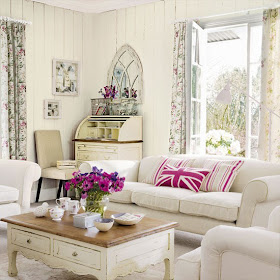
I ran upon this room the other day and just thought it the most delightful mix of things.
Lots of white of course with white board walls and floral curtains and chippy white paint everywhere.
This room just makes me happy. I'd love to spend a summer day in it.
But this room would not be nearly as good if it didn't have the punch of bright pink provided
by the pillows on the sofa.
Those pillows just make the room and keep it from being boring.
Don't you think?

Here are my favorites from last week's Mod Mix Monday...
Angie at Knick of Time created this pretty summer flower garland vase thing.
Isn't this perfect for summer to display single flowers in your home or outside?
I'm searching around here for bottles to do this. So very pretty and casual.
Speaking of bottles, Kristin at Just Wanna Party created a spot in her garden for a romantic dinner for two.
She hung green bottles from the tree and I can just imagine how they glittered in the moonlight.
Here is another bottle idea....Aimee of Twigg Studios makes beachy twine bottles by knotting the twine around a bottle. 
Doesn't it look great with all her things and that piece of coral?
I need to do this too.
And then Musebootsi finished her kitchen! It is a happy mix of colors and things.
You will never have seen a kitchen like this before. 
Just look at those colors! 
What a pretty cheerful mix she chose to use in her vintage bungalow kitchen.

Let's see what you've been up to this last week.
If you were like me...you were busy with Memorial Day festivities and might not have accomplished much.

Please link up your Mod Mix's below.
Remember anything old made over to be new...anything new changed up to look old.
New and old together...
Please include the Mod Mix Monday logo and back link to me.

If you link up..I'd appreciate it, if you'd follow me.

Sunday, May 27, 2012

Open House Sunday

As Promised....
The 2012 Symphony Show House
Every year decorators and furniture stores in Oklahoma City decorate a large mansion and open 
it to the public for tours to benefit the Oklahoma City Philharmonic.
This year the home was in Heritage Hills.
Built in 1925, it was referred to as "The Jazz Age Manor" by this year's show hosts.

I'll go through it room by room with my thoughts.
Of course the outside of the home is just magnificent. No complaints from me here.
This home has had some unfortunate updates made to it that the designers tried to design around and enhance. 
Let's see if they were successful.
Personally, I think it's bordello meets oil baron.
This home is now on the market and can be bought for only $1,800,000.00.
This is the front entrance hall.
Lots of faux painting in this room. It's not offensive but it's not what I would want either.
I think the furniture is not special at all.
An adjacent hall leads to the dining room. Tons of faux painting in this hall. 
It's way too much. I do like the chandelier but that is it.
The formal living room. This looks very old lady-ish.
From the window treatments to the gold brocade sofas. 
There is nothing in this room that grabs me. At least there is no faux painting.
The room is boring.
Dining room 
I like the color of the walls and that is about it.
The master bedroom is painted in egg plant.
It's very dark. I think this room looks gaudy and cheap.
I know the furniture is not cheap...but it just looks tacky.
more of the master.
This room was a sitting room just off the master bedroom.
The same color scheme carries into this room except with more emphasis on gray than the purple.
This room is just a jumble of stuff if you ask me.
The connected master bath.
Again emphasis on purple and black.
Elizabeth Taylor was the inspiration for this decor.
I guess it didn't occur to the designer that Liz was not of the Jazz Age.
The bathroom walls are covered in mirror...so the task was to make the mirrors less noticeable.
That was achieved but this bathroom looks like 1960's Las Vegas.
Little girl's playroom.
Again more faux painting. This time done very badly. Moss green sponge painting all over the walls.
This room was perfect for a baby. 
I could have lived in this room easily. 
The prettiest in the home. Of course it's sicky sweet but that is perfect for a baby girl.
And girl's bathroom.
I love that they left the original medicine cabinet and lights over the sink.
Hate the wall painting.
Boy's room
This room was quite nice for a boy. The blue was not that bright in person.
The desk was polished steel. I'm sure a young guy would love this room.
Office
I think there were animal prints or some sort of animal hyde in each and every room.
Everything in this house is so heavy and ornate.
A funky guest bathroom includes an unusual rough wood sink vanity.
Where the idea came for that...I do not know. Why, oh why?
This bath doesn't seem to fit with the rest of the house at all.
Guest bedroom has a more contemporary feel. 
I liked this room better than others but I didn't love it.
The headboard is cool.
The den off the dining room had a very masculine feel.
More faux painted walls!
Bar and pool in the basement.
This is the downstairs hall bath.
The walls were covered in mirror. The black toilet and sink were pre-existing.
To cover up the mirror....wall decals were designed and stuck to the mirrors.
That was ingenious but this room is still very gaudy. 
The butler's pantry/ bar area lacks all the charm that an old home like this should have.
The large kitchen does not go with the style of the house either.
There are pretty knick knacks brought in by the store that designed this room.
But it just looks like a bunch of stuff.
I'd paint those cabinets white immediately if I bought this home.
This was my favorite room in the house.
It's connected to the kitchen and looks out onto the pool.
I wish the whole house had been decorated like this.
Although, it does not say Jazz Age.
I don't like that mirror.
And finally at the end of the tour, Mom and I ended up on this side porch where we sat for 
about 30 minutes enjoying the day. It was the best part of the tour.
I have to say I loved this furniture. It was very comfortable.

As I said, this house is now on the market.
See the full listing here.

The listing shows the decor as it was before redone for the show house.
It was pretty bad. 
This is an improvement but if I bought this home...I'd think everything needs to be redone again.

What do you think about it?
It's very Donna Decorates Dallas...
Isn't it?

Saturday, May 26, 2012

Weenies on a Saturday

Violet
Franklin and Harvey
Franklin and Harvey
Harvey
Violet
Violet and Harvey
How about those profiles?

No photos of Sally....the little sleepy head
was still in bed.

Thursday, May 24, 2012

Summer of Pier 1

I Want to Play!
That's Amy's deck above from 
She was asked by Blogher and Pier 1 Imports along with four other bloggers to decorate their patio spaces
using $500 worth of stuff from Pier 1 and then blog about it.
Wouldn't that be fun?
As soon as I found out that Amy was doing this...my mind would wander while I 
was working at Pier 1 each day, thinking -  "Will Amy get this....or will Amy get that"?

Today was the reveal.
She turned her deck into a gardener's room.

It's so pretty.

After seeing Amy's reveal, I started thinking what things would I have chosen for my own 
back deck? 
I decided to just go ahead and make my selections and share here what I would 
have bought with $500 worth of Pier 1 credit.

Here is my reveal.....
I don't have any seating out back other than small patio dining chairs so I would need a settee for 
the dogs and I to lounge on.
That took a little over half of my $500 budget.
But I had plenty left over for a cushion, a rug, large floor lanterns and small lanterns to hang in my
redbud tree.
I'd also get a few of the citronella candles in the green urns to keep bugs away and that cute
little turquoise turtle oil lamp.
Can you envision those things out on my deck?
How about at night with all the lanterns about?

By the way....Pier 1 Imports is having a big sale through the weekend.
I did my shopping based on pre-sale prices since Amy did too.
But I could have bought even more right now because so much of what they have is now on sale. 
I just love all the different lanterns shown together glowing at night.

Outdoor cushions are 25% off.
All lanterns $15 and under are 25% off.
Much of the furniture is reduced.


Do go by 

and see all of Amy's pretty deck and visit the other bloggers too and see what they did with their 
Pier 1 money.

You also get chances to win your own Pier 1 money from all of them.

Hey, if you go in Pier 1 this week or weekend...tell them that you read all about their sale on
Mod Vintage Life, a blog written by one of their employees.

Maybe if enough people tell them...they'll make me their official blogger.